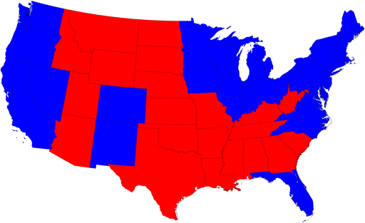
Mark Newman, of the University of Michigan Department of Physics and Center for the Study of Complex Systems, has once again developed some interesting visualizations of the latest election outcome. He examined the traditional red-state/blue-state view:

and then went on to a cartogram of the same, based on population:

However, this only accounts for popular vote. Newman also, interestingly, shows us a cartogram of vote by electoral college, where for example we can note Wyoming as doubling in size.
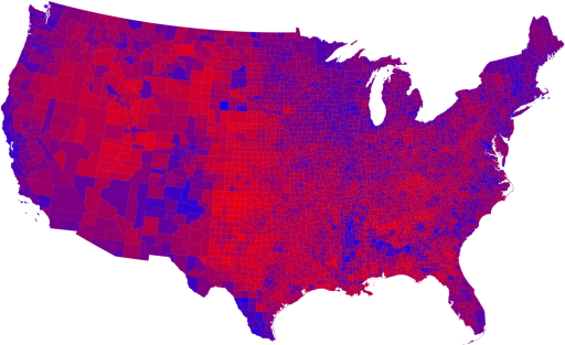
The next set of visualizations deals with county-level views, to drill down to the next level below states - here the urban/rural divide can be noted, as well as some other geographic trends.
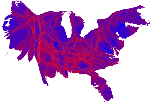
Newman also provides further nuance, with a series of maps and cartograms showing a linear graduated color scheme, based on percentages of voters voting either Republican or Democrat:

And then, a population-based cartogram of the same:

Newman provides considerable additional insight and several more maps and visualizations at his website: http://www-personal.umich.edu/~mejn/election/2008/.
UPDATE: Per Andy Anderson on the NEARC-L listserve (Northeast Arc Users Group),
The Gastner-Newman cartogram software has been implemented as an ArcScript by ESRI's Tom Gross: http://arcscripts.esri.com/details.asp?dbid=15638


0 Response for the " Red States, Blue States... "
Post a Comment